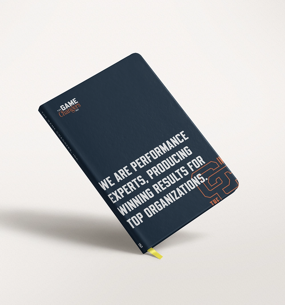
The Game Changers, Inc. exists to coach, train, and inspire leaders, strengthening their leadership, alignment, and execution. Through keynote experiences, leadership team breakouts, executive intensives, and ongoing Leadership Reinforcement and Performance Development programming, they help organizations build the clarity, trust, and accountability that accelerate real performance. It’s a premium offering, built for large companies willing to invest seriously in their leadership. The problem was, their previous brand didn’t look the part.
The existing visual identity had gone stale — it no longer reflected who The Game Changers had become or the caliber of company they worked with. And the fix wasn’t as simple as “make it look more expensive.” The brand needed to feel exclusive and substantial without losing the energy and approachability that made Eric’s team who they were. That tension — premium without stiff, energetic without cheap — was the real design problem.
Early in 2026, The Game Changers brought Kohan Content in to solve it. Pat Kohan took on the client liaison role, keeping the partnership running smoothly from kickoff to launch that summer. But the day-to-day work — the meetings, the back-and-forth, the actual building of the brand — fell to Bobby Windauer, Kohan Content’s lead designer.
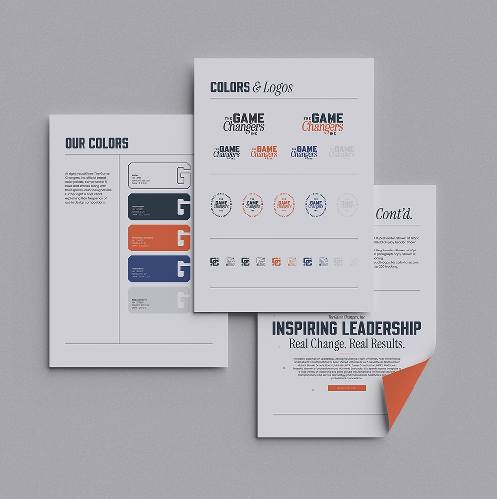
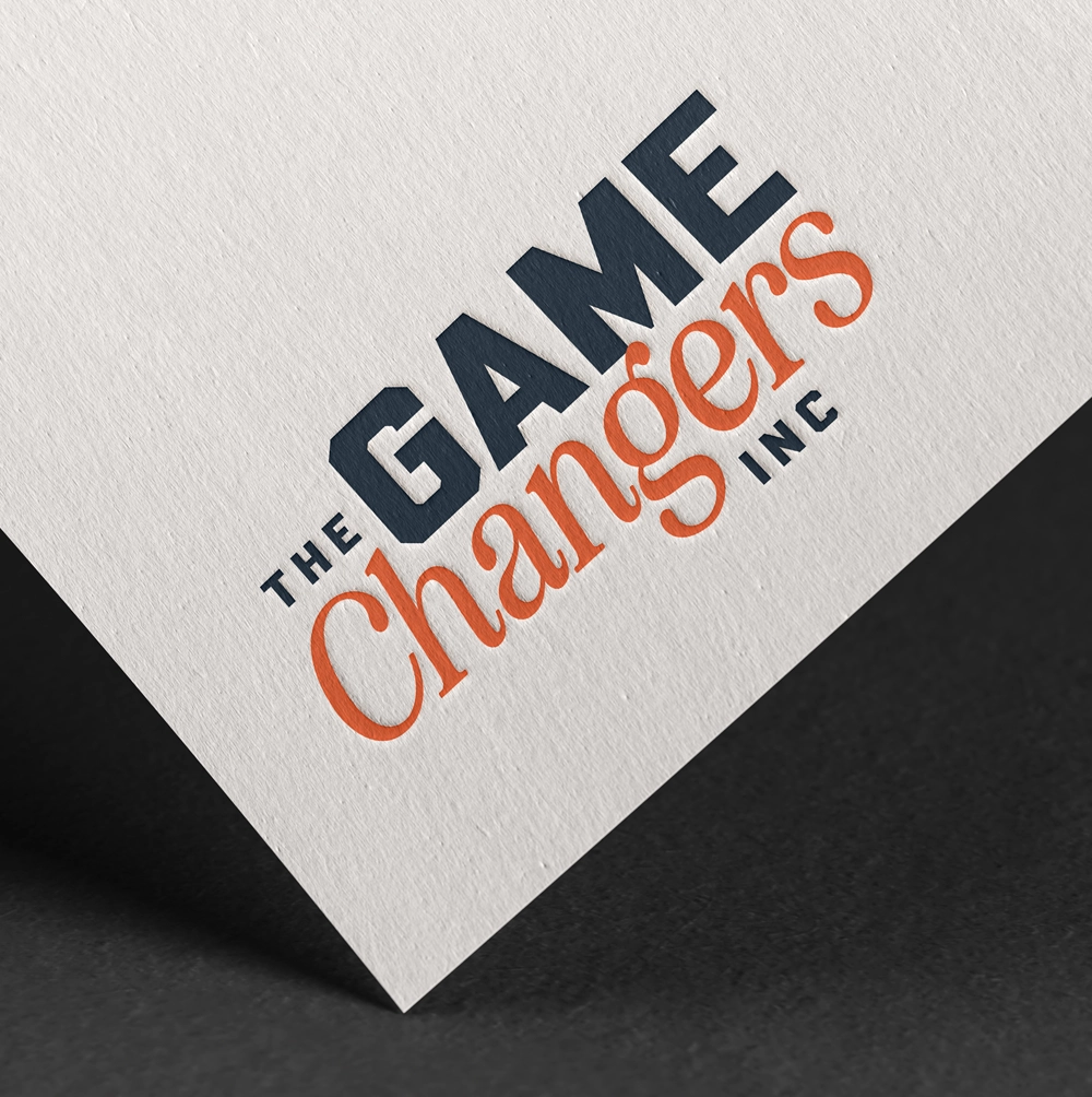
Bobby led The Game Changers team through discovery sessions first, sitting down with key stakeholders to understand not just what the brand needed to look like, but what it needed to feel like to the executives and companies who’d be looking at it. From there came research and mood boarding — establishing direction before committing — followed by a round of competing aesthetics: multiple logo directions, color palettes, typography, photo treatment, all developed in parallel so the right path could be chosen deliberately rather than guessed at early. Only once that direction was clear did the team move to finalize the logo suite and build out The Game Changers’ formal visual brand guide.
What came out the other side was a complete visual system: a new, responsive suite of logos built to hold up across every application The Game Changers would need, backed by a full
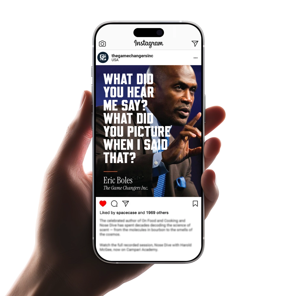
brand guide covering color, typography, and photo direction. It’s the foundation the team is now building on — informing new print collateral and a new website build to come.